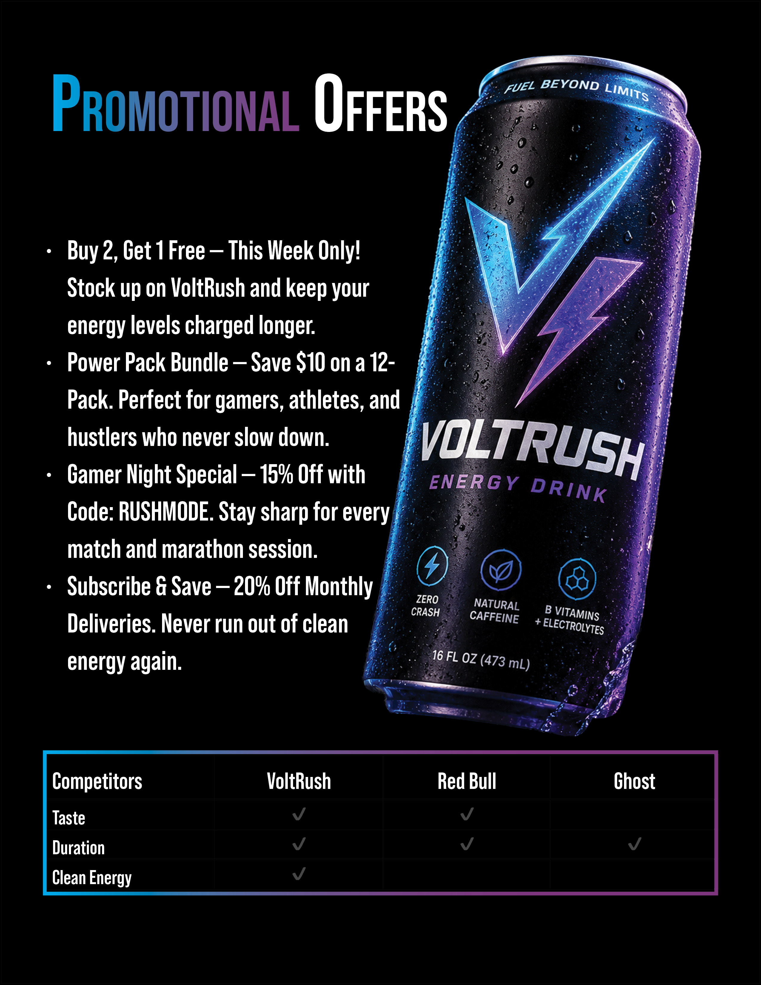
Overview
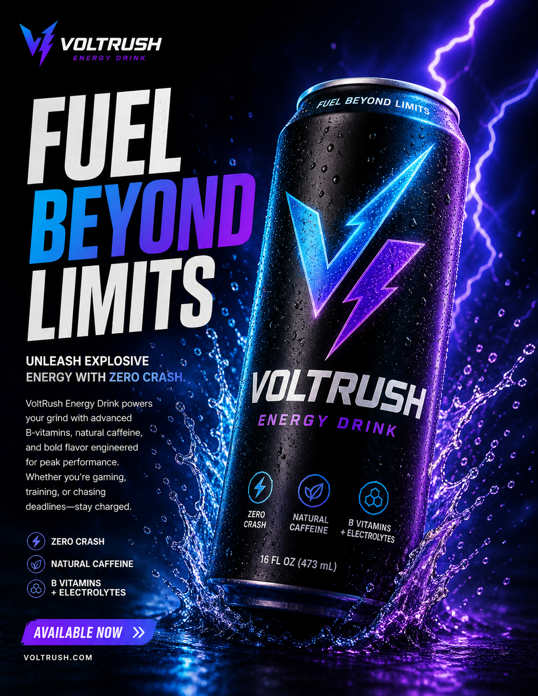
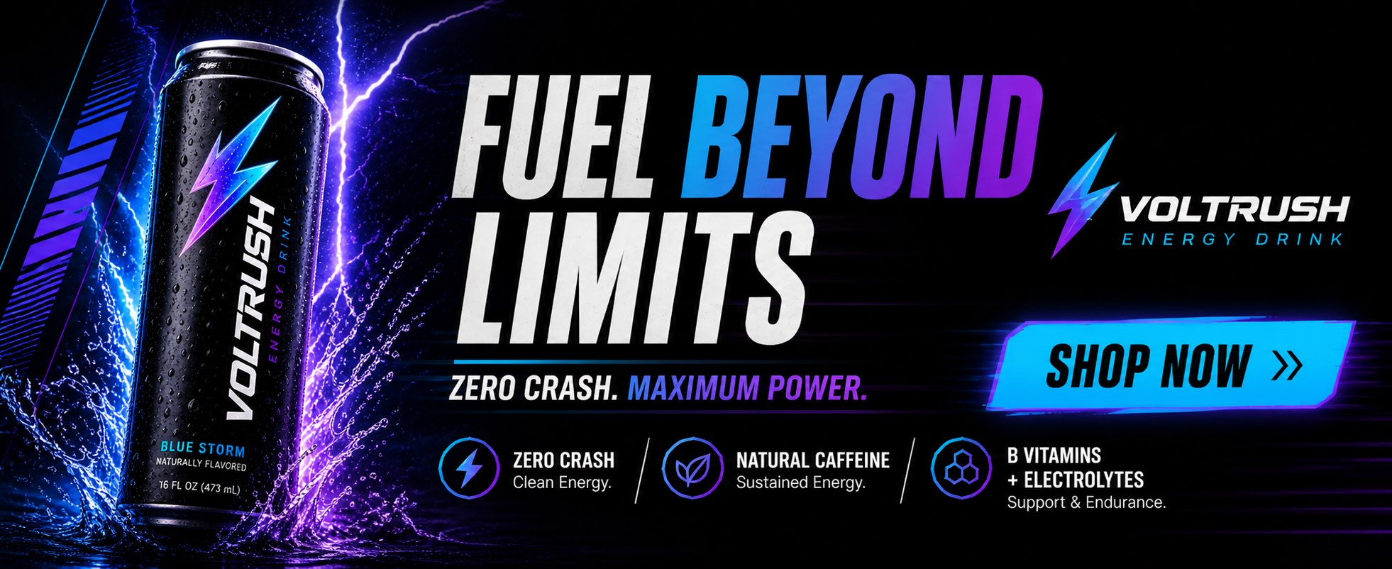
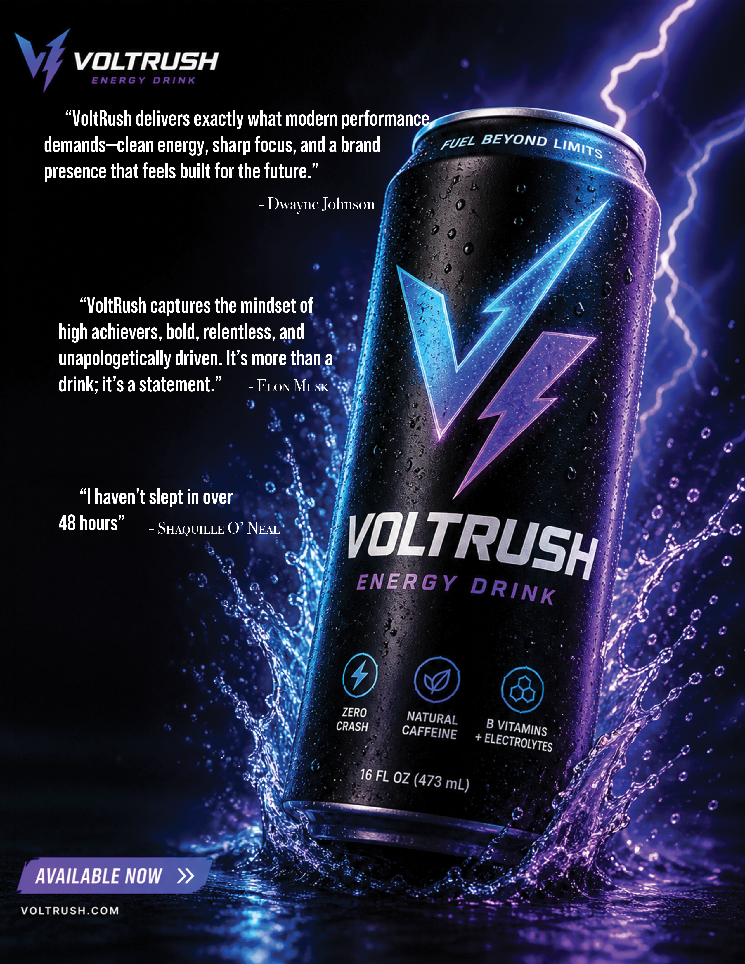
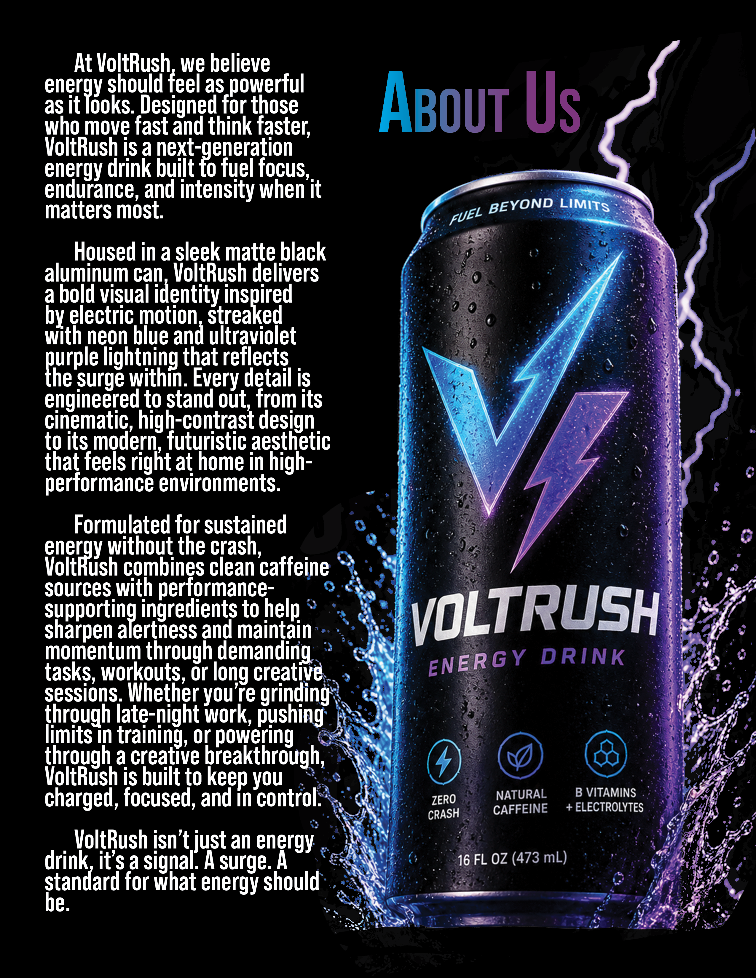
The VoltRush brand was developed to embody speed, power, and futuristic energy. The design process centered on creating a visually striking identity that communicates intensity and performance while remaining clean and adaptable across multiple formats print, digital ads, and product packaging. Every design decision, from typography to color palette, was guided by the goal of making VoltRush feel like a premium, high-impact energy drink built for modern consumers.
Concept Development
The initial concept drew inspiration from electricity, motion, and nightlife aesthetics. Lightning motifs and glowing accents were used to symbolize instant energy and momentum. The brand needed to feel both aggressive and refined, balancing bold visuals with a controlled, polished layout. Early sketches focused on how energy could be visually represented through contrast, sharp lines, and dynamic composition.
Color Scheme
The VoltRush color palette was intentionally limited to maximize impact and recognition. The primary base is matte black, chosen to convey sophistication and to provide strong contrast. Electric blue and neon purple were selected as accent colors to represent energy and innovation. These colors create a high-visibility effect, especially when paired with gradients and glow effects, helping the product stand out both on shelves and in digital environments. The contrast between dark and luminous tones reinforces the charged identity of the brand.
Typography
Typography was selected to match the futuristic and high-performance tone of the product. A bold, sans-serif typeface with sharp edges was used for the main VoltRush logo to emphasize strength and clarity. The font style leans toward a geometric, modern aesthetic, ensuring readability while still feeling stylized. Supporting text uses a simpler sans-serif font to maintain legibility across different sizes and formats. Consistency in font weight and spacing was maintained throughout all materials to reinforce brand identity.
Layout and Composition
The layout strategy focused on hierarchy and visual flow. The product name is always the most prominent element, placed centrally or in a dominant position to ensure instant recognition. Lightning graphics are used diagonally or dynamically to guide the customer and create a sense of motion. Negative space is intentionally preserved around key elements to avoid clutter and to maintain a premium feel. The composition balances energy and control dynamic visuals are grounded by structured alignment.